Smirnoff
We Do We Anthem
DESCRIPTION
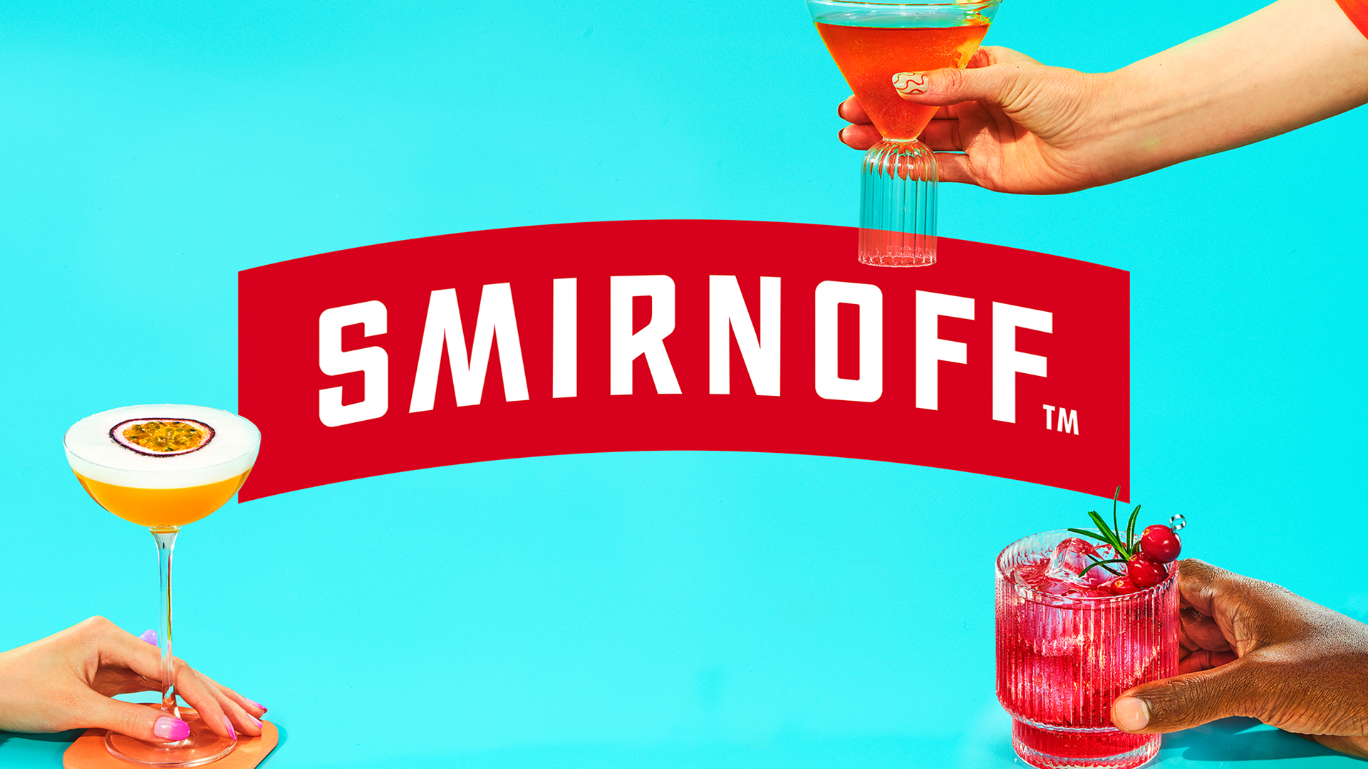
The Smirnoff brand identify had been red, monochromatic and faced inconsistency across its 30+ global campaigns, prompting the creation of a cohesive design system. We started by making the product the main character and designed our approach around it. The goal: to create a system that would work for every product combination and for every market around the world.
What resulted was a kaleidoscope of executions inspired by endless cocktail possibilities and showcasing a diverse community — all of which speaks to the brand’s “We Do We” platform of inclusion.
We went from a multitude of campaigns to one global, consistent message with 2,000 plus assets across more than 30 markets. This redefined our global brand, making it ownable and undeniably Smirnoff.
Truth Well Told: Elevating the bottle as a protagonist facilitated authentic, inclusive representation, while the modular system offered diverse visual combinations, ensuring a cohesive brand identity globally. This streamlined communication boosted brand perception and social media engagement.
CLIENT
Smirnoff
BRAND
Smirnoff
REGION
NOAM
CATEGORY
Design
Digital
Craft
INDUSTRY
Retail
AGENCIES
McCann NY